Part of The Indie Authors Series
JH: A terrible book cover can not only break an author's heart, but hurt the sales of that book. While traditionally published authors have little say (usually) in what their covers look like, indie authors have full control--but that doesn't mean they always get it right, either. Please help me welcome Karen Hooper to the lecture hall today, to share her experience with redesigning her covers and why.
An Amazon bestselling author, Karen Amanda Hooper writes magical romances for all ages. Her books range from the sea to the stars and beyond, including: The Kindrily series (YA paranormal), The Sea Monster Memoirs (YA fantasy), and Virtual Arcana (YA science-fiction).
Karen was born and bred in Baltimore, frolicked and froze in Colorado for a couple years, and is currently sunning and splashing around Florida with her beloved rescued bulldog. She's addicted to coffee, chocolate, and complicated happily-ever-afters.
Website | Facebook | Twitter | Instagram | Pinterest | Goodreads |
Take it away Karen...
 |
| Karen Amanda Hooper |
Okay, so maybe saying your book cover sucks is a tad too harsh. Or, maybe it’s not; it all depends on the cover. However, if your intuitive voice has whispered, or shouted, that your amateur book cover might be the reason your book isn’t selling, then it’s time to change it for the better.
If you haven’t published a book yet, and you have no graphic design experience, but you’ve played around with designing your own cover and you think it’s “good enough,” then thank the internet gods for perfect timing. You found this post before you publicly declared yourself an amateur by releasing a book with a mediocre (or worse) cover.
So, if applicable, here’s an extremely helpful tip…
Get it Right the First Time
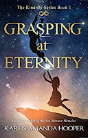
When I published my first indie book, Grasping at Eternity, back in 2012, I had a pretty cover. I still think it’s beautiful and it will always hold a special place in my heart. I was on a tight budget, so I took the photo, hired a friend with limited cover design experience, and hoped for the best. I did the same with the next two books in the series.
Thankfully, possibly by divine intervention, the books had decent sales, but every time I’d look at the covers for books 2 and 3, a nagging voice chided, you can do better. The story deserves better.
A couple years ago, after learning a lot about what a good book cover should be, I hired one of my designers to redo the cover for book 3, Fighting for Infinity. It was a huge improvement, but that pesky book 2 cover still irked me. Truth be told, they all did. Why? It took me years to realize…
Book Covers Shouldn’t Be too Busy
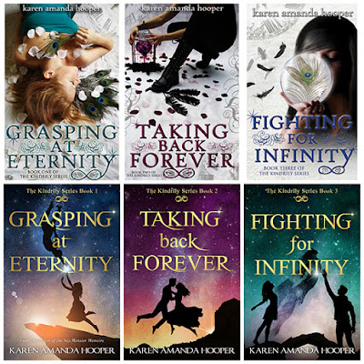
My visions for all the covers were too literal. I tried displaying too many elements of the story and too many symbolic details which made for very busy covers. Also, some readers were confused as to what genre they were trying to represent. In hindsight, I understand the confusion.
Grasping at Eternity’s cover was sometimes mistaken for an adult romance, others had no idea the story contained paranormal elements. Book covers need to represent their genre. Clearly. If they don’t, you’re not doing your story justice or targeting the correct audience, and your sales will most likely suffer. Also, you’ll probably irritate the few readers you do attract.
In a blatant moment of self-promotion, but also to provide you a visual example of my before and after, here are my old covers followed by the new ones that I released earlier this month:
See the difference?
The old ones weren’t terrible, but they were busy and open to interpretation. The new covers are professional, cohesive, branded, and with only a glance you know the books are a supernatural love story.
My experienced cover designer, Michelle Argyle of Melissa Williams Designs, summed it up best in an interview posted on my blog. “I feel like they really incorporate the magical, ethereal quality that was missing before.”
I wholeheartedly agree with her. I also highly recommend her if you’re looking for a great designer who is easy to work with.
Which leads me to my next tip…
Hire a Professional Cover Designer
Marcy Kennedy wrote a helpful post about How to Select and Find a Cover Designer. I’d suggest following her tips to make the process positive and successful. Don’t ignore her advice about researching covers in your genre on Amazon. You want your cover to stand out (in a good way) while also fitting in with the top selling books in your genre. Finding a designer who is familiar with your genre is a must.
Some of you might be
My reply to you. Suck it up, buttercup!
No, but seriously, a great book cover doesn’t need to break the bank. Some designers even offer premade covers at bargain prices. If you go that route, be sure to check the designer’s credentials and reputation. Make sure they are on the up and up with their licensing and copyright usage. Try to find a company who has been in the business at least a few years. They’ll understand the market better and hopefully stay in business for the long-term, which will help if and when you need future covers from them.
Whether you choose a premade or custom cover…
A Quality Book Cover Is an Essential Investment
Yes, indie publishing can get expensive, but if you want to be even somewhat successful in this business, the two areas where you shouldn’t skimp are quality editing and a professional cover. If you try to do it yourself, or let an inexperienced friend help you because it’s cheaper, you’ll end up paying a lot more later when you realize you need your books redone. I learned that lesson the hard and expensive way.
My biggest loss, besides paying multiple times for cover designs, is how many potential YA paranormal romance readers never noticed my books because the covers didn’t catch their attention. The old covers didn’t clearly represent my genre or the story, therefore, I probably missed out on a lot of readers.
Readers DO judge books by their covers. That’s why covers were created. Please don’t think you’re an exception to the rule and haphazardly whip up your own cover in Photoshop, or some other design software, then wonder why your mother is the only person who purchased your book.
Your Book Cover Is Your First (And Possibly Only) Impression
Make it a good one.
You need a professional, quality book cover to get noticed in the ever-expanding sea of books for sale. As years go by, more people are trying self-publishing, which means the number of books for sale is always increasing. Unlike brick and mortar bookstores, inventory on ebook retailer sites aren’t removed when a book doesn’t sell. Anebook’s shelf-life can be eternal. All these factors mean it’s becoming more difficult to get noticed and/or makes sales, especially if you’re a new author.
I’m not saying any of this to dissuade anyone from indie publishing. I’m a firm believer that everyone’s story matters and if you want to write a book and share it with the world, then do so. However,give your book the best odds of being discovered by representing it properly and professionally.
The Bare-Bones Breakdown
Here’s the gist of it. First and foremost, make sure you’ve written a great freakin’ story. Next, make sure it has been edited well. Lastly, because everyone who ever sees it will be judging it, make sure your cover doesn’t suck. If your current cover does suck (you know who you are!) and you don’t want your book to disappear into a black abyss never to be purchased again, then redo the cover. And do it right this time. Trust me, it’s worth it.
About Grasping at Eternity
 Leave it to Maryah Woodsen to break the one rule that will screw up eternity: Never erase your memories.
Before entering this life, Maryah did the unthinkable—she erased. Now, at seventeen years old, she’s clueless that her new adoptive family has known her for centuries, that they are perpetually reincarnated souls, and that they have supernatural abilities. Oh, and she's supposed to love (not despise) Nathan, the green-eyed daredevil who saved her life.
Nathan is convinced his family’s plan to spark Maryah's memory is hopeless, but his love for her is undying. After spending (and remembering) so many lifetimes together, being around an empty version of his soulmate is heart shattering. He hates acting like a stalker, but has no choice because the evil outcast who murdered Maryah in their last lifetime is still after her.
While Maryah’s hunter inches closer, she and Nathan make assumptions and hide secrets that rip them further apart. Maryah has to believe in the magic within her, Nathan must have faith in the power of their love, and both need to grasp onto the truth before they lose each other forever—and discover just how lonely eternity can be.
Amazon| Barnes & Noble | iTunes | Indie Bound | Kobo | Google Play |


I like your old covers better.
ReplyDeletelol. Thanks, Sara. Goes to show that it's all subjective, right?
DeleteYou made the right decision. Seeing your old covers, my first impression was..too busy, to fussy, too cluttered. I like and prefer the simplicity of the new covers and I got the message immediately.
ReplyDeleteThanks! Goal accomplished. :) I will always love the old ones but I prefer the new ones too.
Delete